Bar Graph: Dose Response
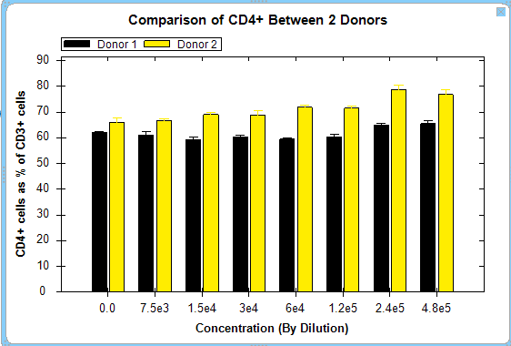
 The Bar Graph feature allows dose response curves or metrics to be displayed as bar graphs. Below is an example comparing immunophenotyping between two different donors.
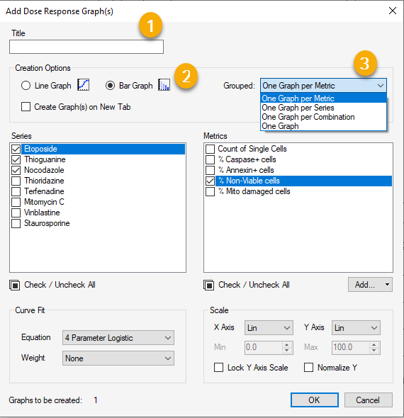
You can create a dose response bar graph by clicking on the icon in the tool bar. This displays the Add Dose Response Graph(s) dialog box. It is optional but recommended to add a title to your graph, as shown in (1).
Next, you may select the bar graph option within the Creation Options section of the dialog box (2).
You then may choose to display and compare using the drop down menu (3) to select one of several different metric and series display options.