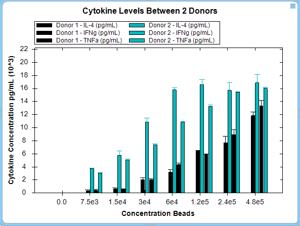
The Bar Graph: One Graph option shows a single graph for any selected series and metrics. The example below provides a comparison of cytokine levels between 2 different donors.