|
ForeCyt Reference Guide (Version 8)
|
QC Viewer
Automatic QC has three tabs where you can view information about your instrument's QC test.
![]()
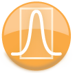
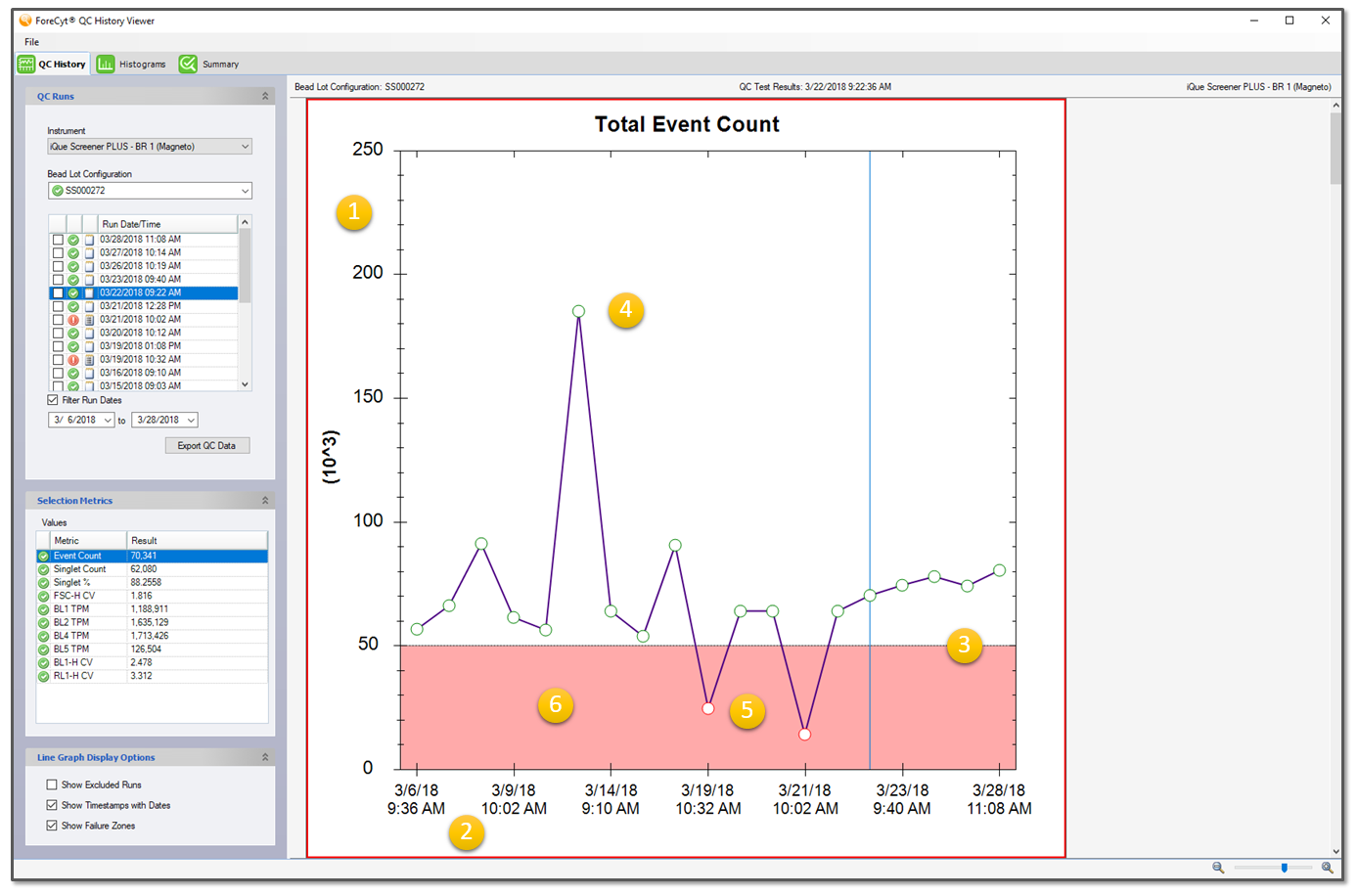
QC Sidebar
The QC Sidebar is shared by all three report tabs and includes selection and filtering controls specific to each tab.
(1) Instrument: Selects any active iQue3/iQue PLUS that has been configured to run QC.
(2) Bead Lot Configuration: Includes all bead-lot configurations for the instrument. Active configurations are marked with a green checkmark.
(3) Run/Date/Time
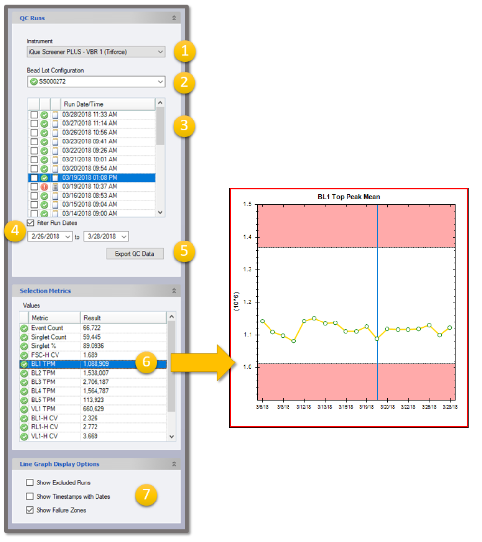
-
Line graph Excluded status: Checked runs are not shown on history line graphs
- Status icon: pass (green check mark) or fail (red “X”)
- Notes field: clicking icon opens an editable rich-text field
- QC run date and time stamp
A vertical blue line designates the selected QC Run in all of the line graphs unless that run has its Excluded checkbox checked. Clicking a data point in any line graph in the right view pane causes that run to be selected in the sidebar Run Date/Time list.
(4) Filter Run Date: When checked, the Run Date/Time list is limited to runs within the ranges specified in the drop-down menu. The dates default to the last 30 days. It is possible to select date ranges that filter out all data, in which case the view pane will be empty and show No Results to Display in the title.
(5) Export QC Data: Exports all runs in the QC Date/Time list. The export consists of an archive (ZIP) file having one FCS data file per run, screen shots of the Summary tab results list, and a single CSV file of the run summary metrics (having one row per run).
(6) ValuesThis is a list of metrics and the associated result. When you click on it will highlight the corresponding plot with a red border. Conversely, clicking a graph in the right pane causes that graph to be selected with a red border and the corresponding metric to be selected in the sidebar Values list. Double-clicking a metric in the Values list causes the corresponding graph to be selected with a red border and automatically zoomed in the view. Double-clicking a metric in the Values list causes the corresponding graph to be selected with a red border and automatically zoomed in the view. Double-clicking the same metric again will cause the view to zoom back out.
(7) Line Graph Display Options:
- Show Excluded Runs: If you Excluded any run, selecting this option includes them in the history Line Graphs.
- Show Timestamps with Dates: By default, timestamps are not shown in dates on the line graph x-axis labels. Selecting this option displays the timestamps.
- Show Failure Zones: When checked, the failing side of the criteria lines are displayed in light red.
QC History Tab
QC History provides a series of line graphs with one graph per system quality control metric type on the y-axis (1) and runs ordered by date/time on the x-axis. (2) In addition, these plots include horizontal control-lines to show manufacturing specification limits (upper and or lower boundaries, as applicable and on scale) (3). Passing metric data points are plotted as green circles (4) and failing data points are plotted as red circles (5). The failure zones are marked by a red screen to signify the failing portion of the horizontal control-lines (6). Left-clicking on or near a point will select that run and display a vertical blue line behind that data point. Double-clicking a graph will auto zoom that plot to its maximum size in the view.
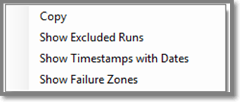
Double clicking a zoomed in plot will zoom out. Right-clicking on a history line-graph displays a context menu with the following options:
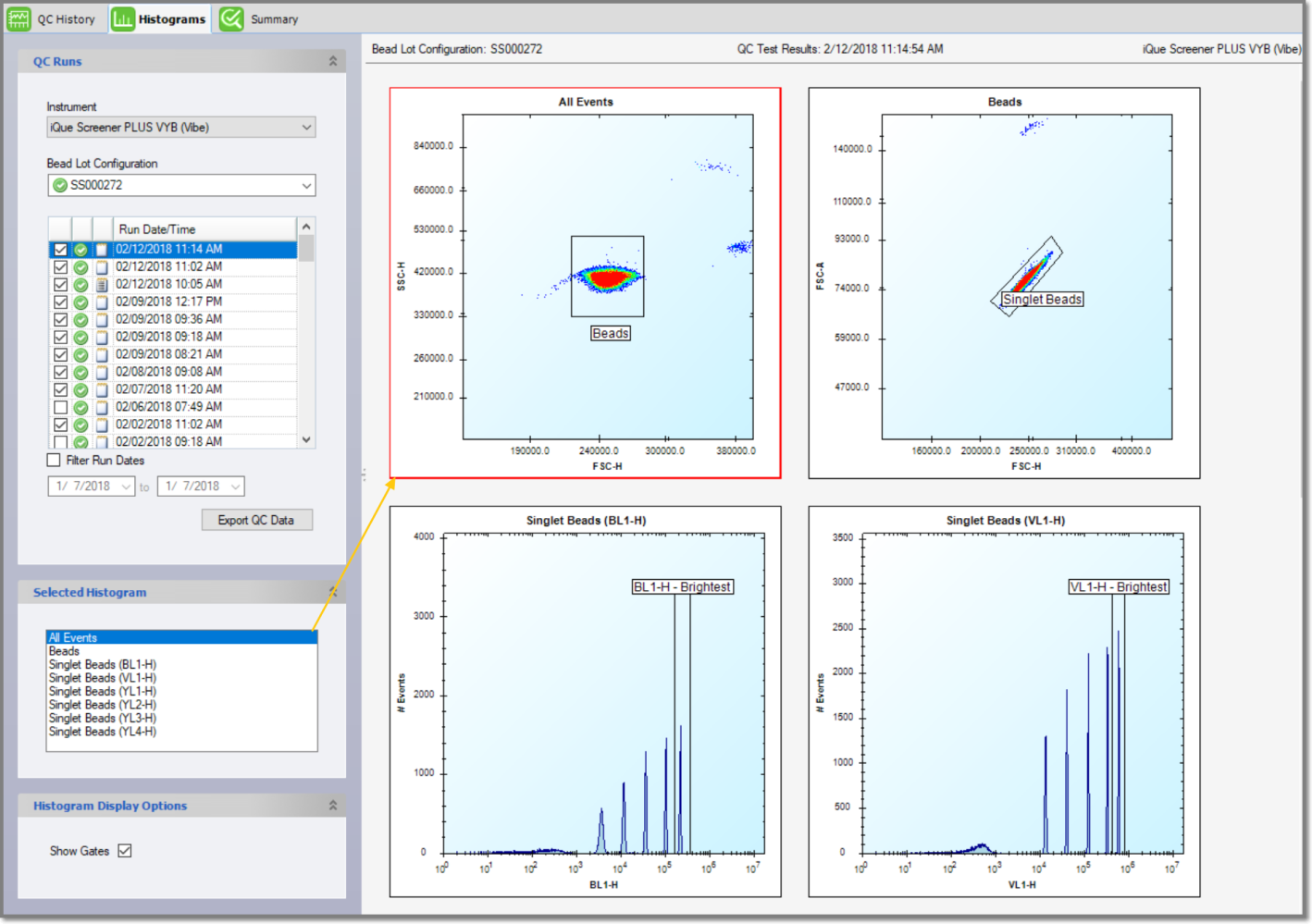
QC Histograms Tab
When you click on the Histograms tab, the QC sidebar changes to reflect the Histogram options. You select a Histogram by clicking on it in the Selected Histogram pane and it appears with a red box around it. Show Gates is selected by default but you can choose not to display them by clicking the check box. You can zoom and pan the plots using the mouse scroll-wheel and by left-clicking and dragging a selection region. Double-clicking a histogram plot or on a Selected Histogram list item will automatically zoom in to that histogram in the view. Double clicking it again will zoom out. Right-clicking on a plot brings up a context menu with options for setting the plot scale and for saving the current plot as an image file.
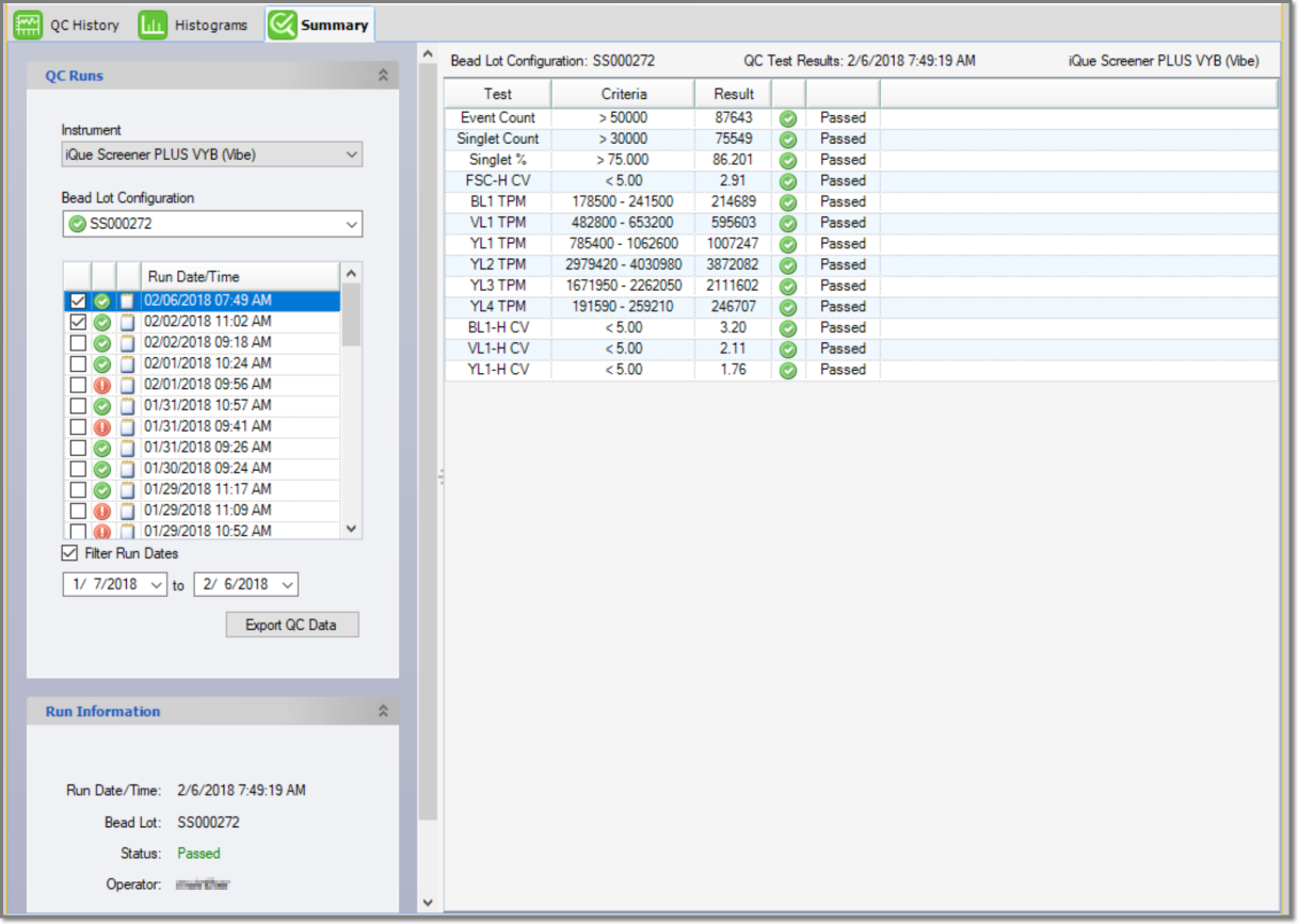
QC Summary Tab
QC Summary display by default when a new run completes. It consists of a metric table in the right pane. The sidebar changes to include run-specific information. The Summary provides details about a run, including the name of the Operator (which is not listed elsewhere).