|
ForeCyt Reference Guide (Version 8.1)
|
Dose Response

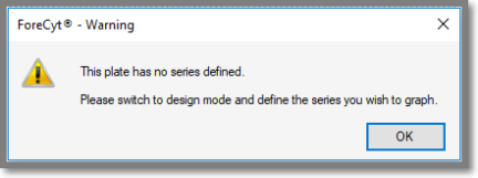
Create Dose Response curves from experimental data by clicking on the Dose Response icon. You must have already created at least one Series in the Design tab before you can create Dose Response curves. If you have not done this, clicking the Dose Response tab will return this message.

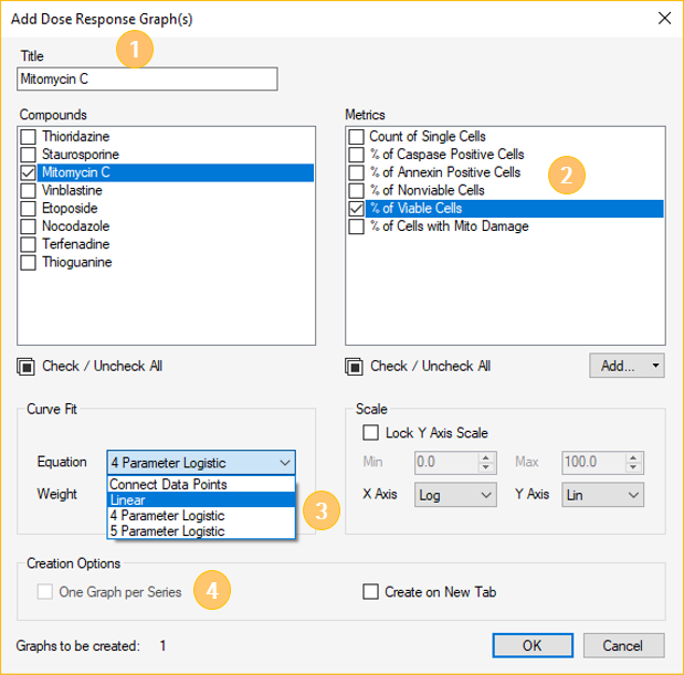
If you have data from at least one Series, clicking the Dose Response icon opens a window where you will apply specific parameters. This screenshot shows this process. Although it’s not necessary, to give the Dose Response curve a title (1); it’s a good practice. In the following example, the title is Mitomycin C. Select the compound(s) from the list by checking the boxes. You may select multiple metrics to plot in a single graph (2). In this example, Mitomycin C is plotted as percent viable cells. Please note that if you select more than one metric you will create a separate graph for each metric. Then specify the Curve Fit equation (3). If you have selected multiple compounds, then multiple compounds will be displayed on the same graph, unless you select the "One Graph per Series" under "Creation Options" (4). If you select the "One Graph per Series" option then you will make a separate graph for each compound you selected. Once you have selected all the parameters to generate a dose response graph, press "ok".

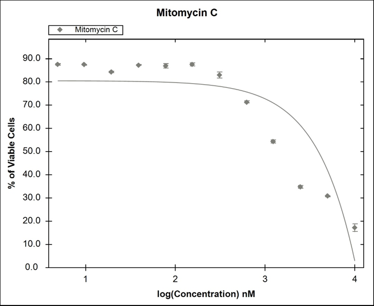
These steps produced the Dose Response curve, shown in the following screenshot. The data points are represented by a diamond shape in the color of the Series. The colors were designated when the Series was created in Design. If the plotted Series includes replicates, the point is plotted at the average of the replicate values with error bars for the standard deviation of the points as shown in the following screenshot.
