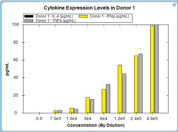
The Bar Graph: One Graph per Series option displays all the selected metrics and a single series per graph. In the example below, cytokine expression levels for an individual donor are compared.