|
iQue Forecyt® Reference Guide (Version 9.0)
|
Plot
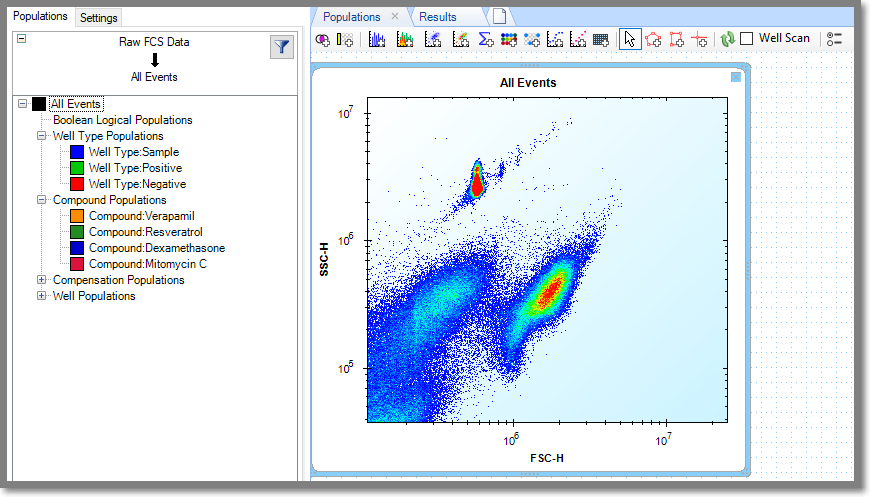
 When you click on the Add Plot icon in the tool bar a default All Events plot opens. All Events includes both well sampling, and events between sampling such as rinses. If you want to add a Plot for a specific population, drag it from the Population hierarchy
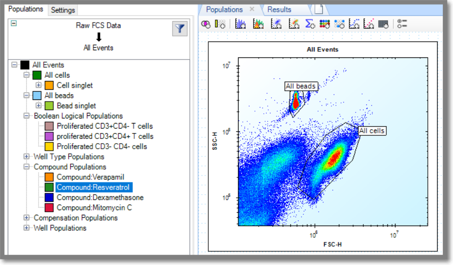
In the following example we gated the beads and cells.
Plot Gating Tools

The gating tools are enabled when you select a Plot by left-clicking on it.
Polygonal and Square Gate
![]()
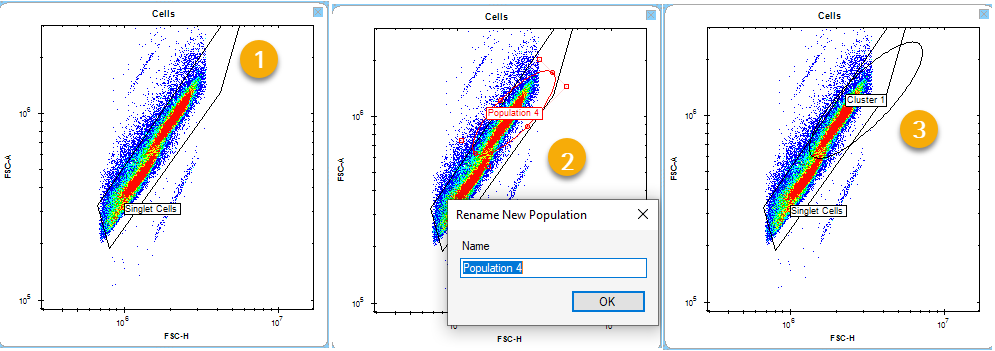
The following screenshots show the polygonal or square gating tools that are used to draw around the population of interest (1). Start by left-clicking, dragging a line and left-click to define a point. Right-click to close the gate. When you right-click to close the gate, a label box opens so you can name the population (2). The newly created gate is red, marking it as enabled. You can drag it by control-clicking on it. Clicking outside the gate turns it black. When it turns black it is no longer enabled (3). Left-clicking at any point on the gate re-enables it. You can shift-click directly on the population label to move it if it's in the way(4).

Elliptical Gate

The screenshots below show the elliptical gating tool that is used to draw around the population of interest (1). At the top of the page, click the "Add Elliptical Gate" icon. Move the cursor to the population you want to select and drag it open to dictate the size and location of the gate. Release the cursor when you want to close the gate. When you close the gate, a label box opens so you can name the population (2). The newly created gate is red, marking it as enabled. You can drag it by clicking on it. Clicking outside the gate turns it black. When it turns black it is no longer enabled (3). Left-clicking at any point on the gate re-enables it. You can shift-click directly on the population label to move it if it's in the way.
Clicking on the side of the ellipse gate allows you to stretch and rotate the gate, while the clicking on the corner of the ellipse gate allow you to resize the gate.
Region Gate
![]()
The following screenshot shows adding a Region Gate to a plot.
(1) The Plot before clicking on the Region Gate.
(2) When you click on the gate, a box opens that allows you to name the Region Gate. The Region Set appears in the sidebar. The Region Sets are color coded and labeled: LL = lower left, LR = Lower Right, UL = Upper Left, UR = Upper Right of the plot. (3) Clicking the boundary of the plot reveals the percentage of events within each region. You can drag the gate around and even bend it at angle to enclose populations of interest.

Switch Axes
![]()
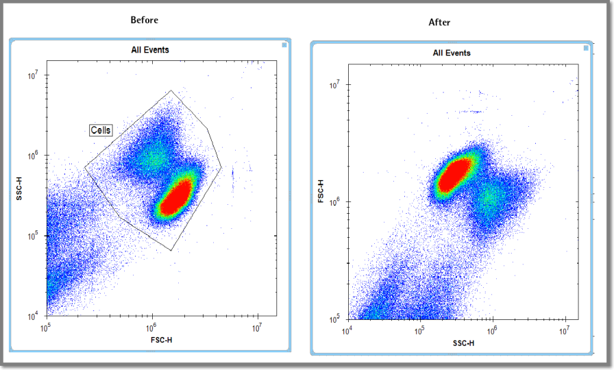
When you click on the Switch Axes icon, iQue Forecyt® immediately switches the Axes. There is no confirmation message. When the axes are shifted any gating and labeling are removed, as shown in the following screenshot.
Style (Dot Size, Gradient)
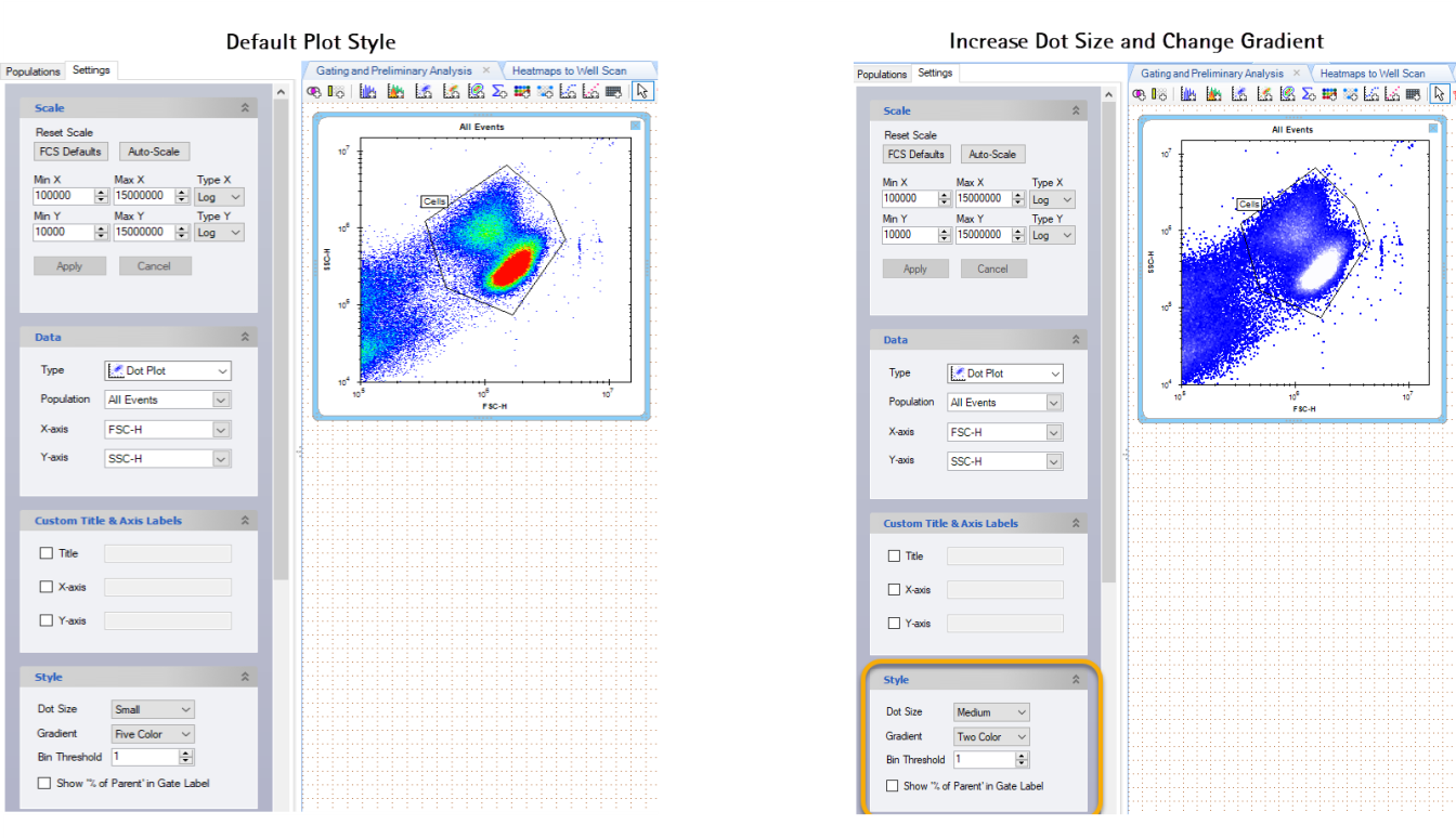
The Style pane refines the visualization of your data. In the following series of screenshots we changed the Dot Size from small to medium and moved the Population label by shift-clicking and dragging it. We changed the Gradient from Five Color to Two Color.
Style (Bin Threshold)
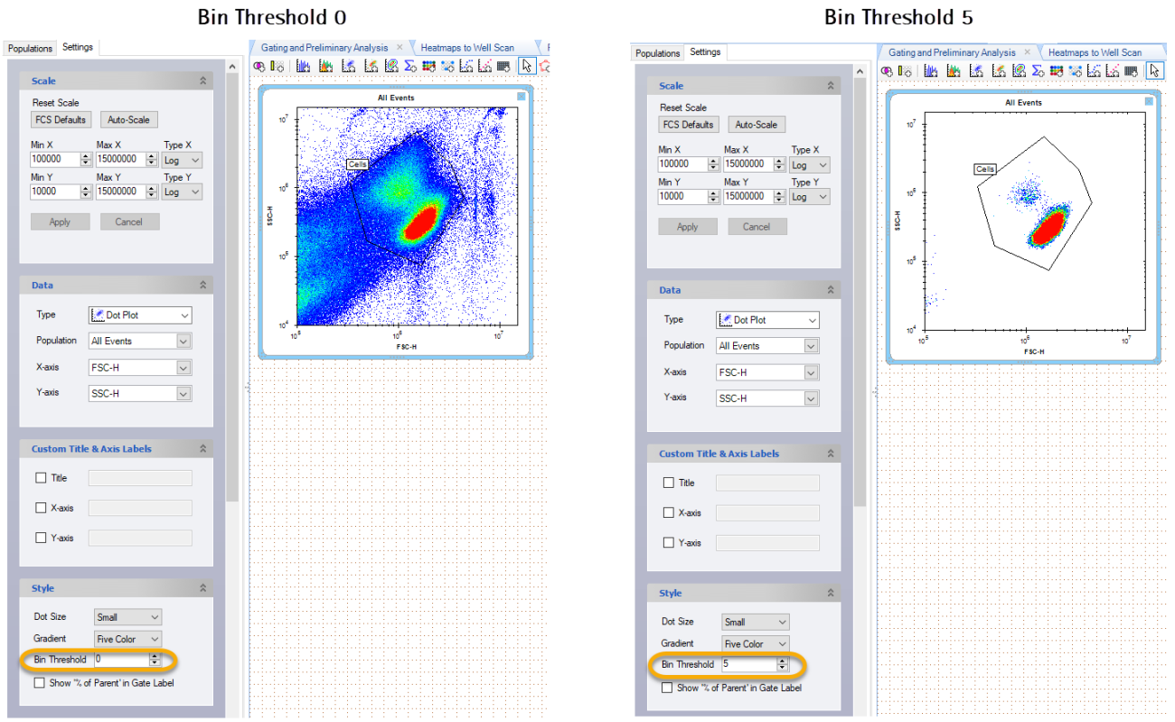
When you increase the Bin Threshold, you decrease the number of events shown on the plot. This can be useful for removing excess, irrelevant events to refine the population for gating, or, amplifying the main population of interest. The following screenshots shows the difference when the Bin Threshold is set to 0, and set to 5 .
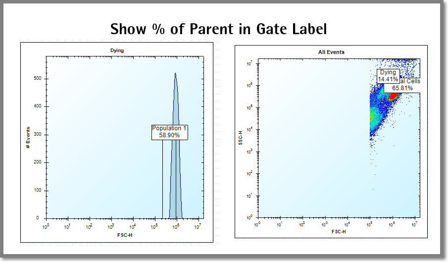
Show Percentage of Parent
This gate label displays the percent of the parent population contained in the gate. You can toggle it on or off with the check box. The following screenshot shows an example of Show % of Parent on a Histogram and Plot.
Well Scan (Plot)
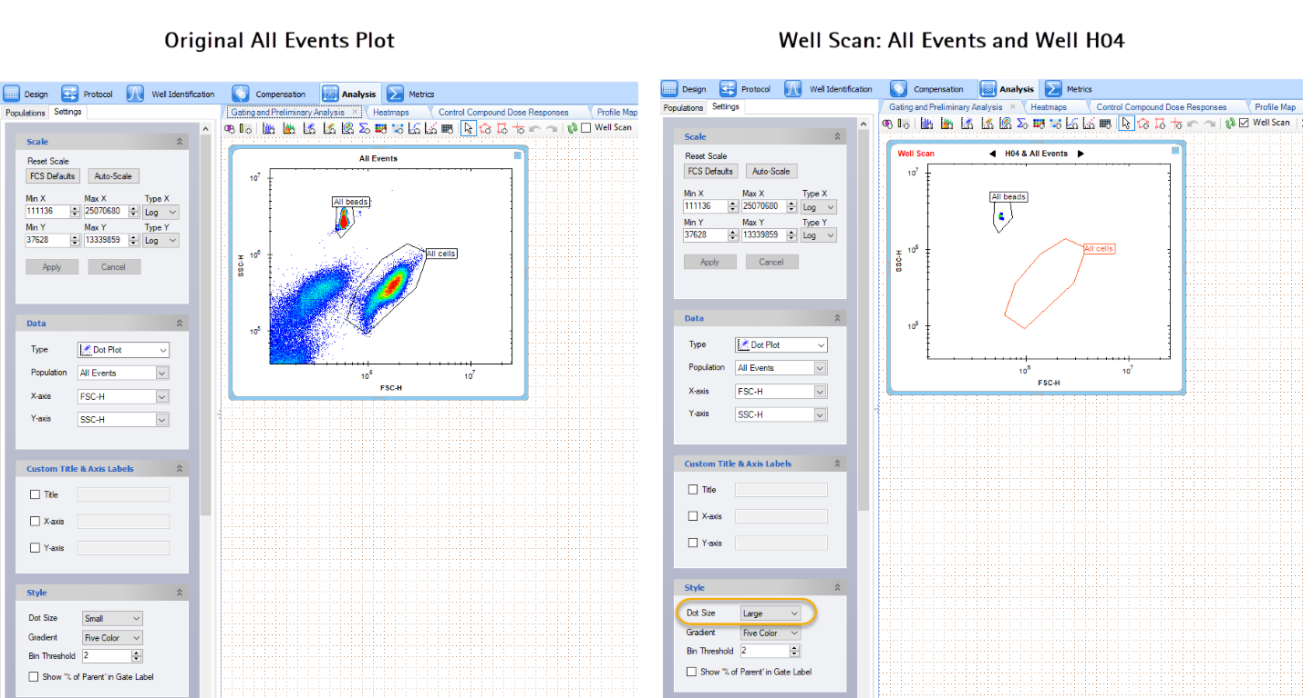
The following screenshots show All Events and All Events with Well Scan of H04 Because of the small number of events in the well, we increased the Dot Size to Large.
