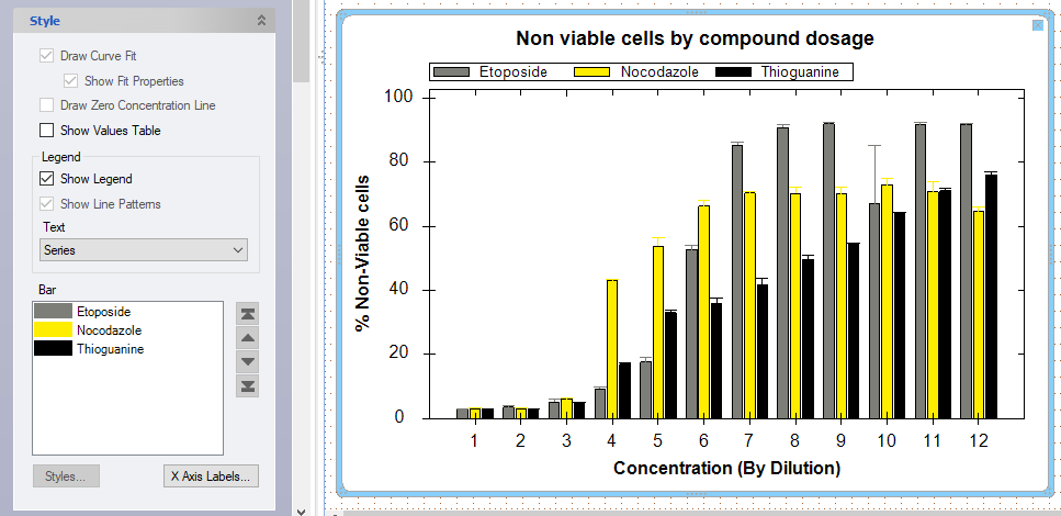
Style: dose response bar graph
The Bar section of the style pane allows users to customize the display and organization of curves and associated legends.
When multiple metrics are displayed in a dose response bar graph, note that the order of the legend names can be arranged under the Bar section. To re-arrange the legend, select a bar in the dialog box and use the arrows on the right hand side to move the selected bar name up or down in the list. As shown below, Etoposide non-viable cells were moved to be displayed first on the legend.
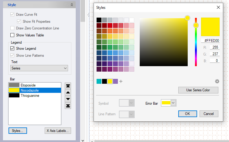
The bar color can also be customized by selecting a bar and clicking the Styles button. This dialog box also allows for a series color to be selected. Custom styles are applied to one bar at a time.
By default, Series use the color they were assigned from the design tab. The Error Bar setting defaults to the assigned color or can be set to black.
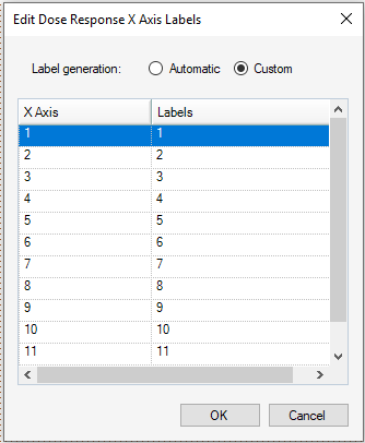
X-Axis Labels
 The X-axis Labels option allows customization of the x-axis labels by clicking the custom option. Then click on the dialog box to add the custom label, then click enter.