|
iQue Forecyt® Reference Guide (Version 9.0)
|
Heat Map
 A Heat Map is a powerful visualization for screening assays because it allows you to see the data values on your plate represented as a gradation of color to better identify wells of interest in a plate.
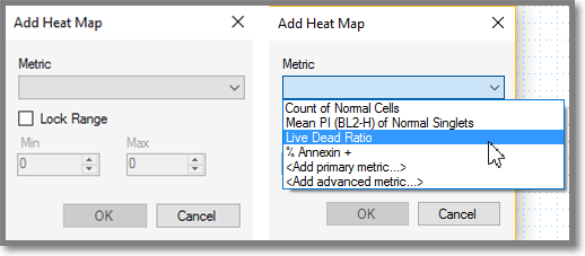
You must define Metrics before you can create a Heat Map.
When you click on the Heat Map icon the Add Heat Map menu opens
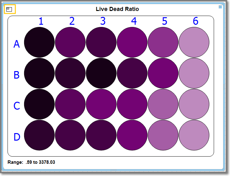
The following screenshot shows the Heat Map created of Live Dead Ratio.
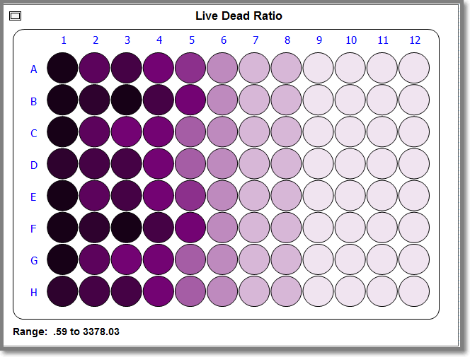
After you have created a Heat Map you can adjust the viewing area with the small rectangle in the upper-left corner. Clicking on a corner of the rectangle selects a specific quadrant to view as shown in the following screenshot. You can continue clicking in each quadrant and when you have clicked all 4, the plate map resets to show all wells.